How I learnt to stop worrying and embrace the blowout
I grew up shooting film and fell off the wagon when things moved to digital. I had a string of Canon Ixus point and shoots and only just got back into photography with a micro four thirds camera. You can tell a lot about my shooting style by knowing how far I want to escape the point and shoots.
One of the worst things that Canon point and shoots do is blow the highlights out to white. Even in good light you can end up with over exposed, burnt out and horrible photos. Whole areas of the image with lost detail because it’s just a sea of plain white pixels.
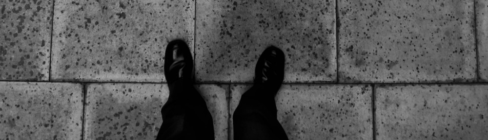
Everything is just grey
Using point and shoots gave me a taste for the ‘rescue highlights’ function in iPhoto, the curves tool in Photoshop and the ‘recovery’ function in Adobe Lightroom. But recently I’ve realised that I may have gone too far.

The image above would be fine if I’d left the whites alone. As it is, look at how flat the photo appears. It’s actually quite contrasty but without the white pixels it’s just a sea of grey.
Embracing the highlights
To help ween me off my greyscale addiction I’ve been experimenting with presets and filters for Lightroom. The irrepressible Eric Kim has made his presets for Lightroom available for free at http://erickimphotography.com/blog/2010/09/eric-kims-free-street-photography-lightroom-3-presets/ I’ve submitted a couple of my photos to his settings. Most just scared me back into my comfort zone but a couple have shown me why I’ve got to stop worrying and embrace the blown highlights.
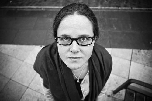
As you can see, there are patches that are blown out, but the overall feel of the image is so much better. This is a RAW photo with only Eric’s presets and no other post-processing so it’s forcing me to get a feel for the contrasty vibe you get by leaving the extremes of an image intact.
As an experiment I took the original photo from the Frieze art fair last week in London back through Lightroom to see what it was like without the greyscale hammer. The result is much higher contrast. I’m not sure that it feels like “me”. Somehow it’s too hipster for my tastes. The high contrast style seems too much like it’s trying to be a LOMO or 1970’s pinhole camera. Even so, I can tell that this version of the image has something to teach me.

The GF2, like the GF1 before it, seems to love being shot straight into the sun or in other tough light situations, so leaving in the highlights is going to allow me to get much richer images. Exciting times.
If you’ve ever struggled to get a black and white image right then leave a note in the comments about how you made it work. I’m keen to check out more examples of how post-processing changes the style of a B&W image.